Powered By Blogger

Thursday, December 21, 2017

Monterey Bay Derby Dames vs Derby Republic 20171007

Monterey Bay Derby Dames vs Derby Republic
7 October 2017.  Water City Roller Sports. Marina, CA.

some photo highlights:

mbdd_vs_republic_L3613436

mbdd_vs_republic_L3613379

mbdd_vs_republic_L2017896

mbdd_vs_republic_L2017851

mbdd_vs_republic_L2017826


mbdd_vs_republic_L3613380

mbdd_vs_republic_L2017872

all of the photos can be found on flickr here:

https://www.flickr.com/photos/nocklebeast/sets/72157689320604826


Sunday, December 10, 2017

lil killa and mini mayhem: compelling frame: lesson 1 frame 7


scdgroms_vs_angelcity_L1065567 1

21 February 2016. Angel City vs Santa Cruz Derby Groms.  Craneway Pavilion, Richmond, CA.

 One last derby photo (a feature photo this time).

  1. It's just a little quiet moment before the bout. Lil Killa is using a tool to adjust her skate.  Mini Mayhem is using a massage tool on her leg.
  2. Horizontal. 3x2.  I purposesly framed Lil Killa to the far right of the frame and to get Mini Mayhem in the frame too. I think it took 3 tries to get the framing the way I liked it.
  3. The diagonal of the track and chairs guide the eye between the two principal subjects.
  4. This is at the Craneway Pavilion.  It's mostly indirect natural morning light coming in from the far left of the photo and it is gorgeous.  
  5. I'm about15-20 feet away. I'm standing (above the sitting skaters) but I may be crouched down a bit.
  6. It's a moment of focus on small tasks before the bout. 
  7. There are two skaters with similar tasks that are a repeated element.
  8. I suppose some of the water bottles "clutter" the photo.
  9. Ah, the old balance question.  I think so, yes.


Friday, December 1, 2017

angel city vs emerald city junior jammers at the Big O 2017: compelling frame: lesson 1: frame 6.

Back to derby.

d3t2b1_emerald_vs_angel_juniors_L3610461

7 May 2017. Lane Community Event Center. Eugene, OR.  Emerald City (black) vs Angel City (white) juniors.

f3.4. 1/180th.  ISO 800. Leica M-240 with a 60mm Konica Minolta Hexanon-- cropped-- shot from center track, turn 1-2 with a little on-camera flash and off-camera flash to the left.

The questions:

  1. As with most derby-action phtoos, the intent is to show some sort of sportsy intense roller derby action moment-- this jammer shot has two jammers -- one chasing -- being chased by the other.
  2. I always find it easier to shoot horizontal and while gently cropped -- I did keep the same 3x2 aspect ratio.  these sorts of shots-- I almost always leave a bit of room in the frame for the skaters to skate into.
  3. lines & shapes:  There's the line of the track boundary -- the line of the sport court and the repeated shape of the 2 jammers-- the dominant "line" is the line if you could connect the head of the white jammer to the tail of the black jammer-- that's what commands the eye's attention.
  4. the light-- is a mix of ambient and the strobe-- the background is blurred by the two light sources as well as the faster hands and feet of the near skater.  The off-camera flash to the left make the leading face/shoulders/face mask glow-- which is really quite nice.
  5. I'm shooting from center track standing up-- so I'm a little higher than the skaters-- I imagine it might be a stronger image if I was crouching a bit-- but it's hard to do that shooting center track-- I have to keep 1/2 an eye on the inside referees after all.
  6. The moment is two jammers chasing. I wonder if the moment was a bit latter-- the black jammer about 2 heads closer to the white jammer with her dark helmet framed by the other jammer's white jersey-- would that image be stronger-- a bit more dramatic if the two jammers were closer together?  yes-- but it's sports photography-- you get the moment that you get-- the moment that is presented to you.
  7.  I do like the repeated elements of the two jammers in very similar poses- one black-- one white.
  8. The background elements are not so important to the image.  I think the image would work better if the background was of an out-of-focus audience instead of vendor tables.
  9. It's a color photograph-- it's red and black and white.  Nothing too clashy -- or noteworthy-- but the red stars work nicely-- the common element of the two jammers.
  10. I think the image is balanced.
also the printed glossy version does look nice.

Sunday, November 26, 2017

the moss island of the icelandic highlands: compelling frame: lesson 1 frame 5.

F208_L2100495

18 August 2017. The highlands of Iceland.  Leica Q. f4 1/400 ISO 100.

Yet another quirky out-of-focus landscape.

Let's go. This is some sort of moss-like plant in the highlands of Iceland during summer.

  1. My intent.  Is to make a "landscape" of something that is small.
  2. It's a landscape -- so landscape orientation and 3x2 because that's what the camera does and I typically don't crop landscapes-- not even lightly
  3. Lines and shapes-- we have a bright green out of focus horizon and an out of focus mountain range in the background and a diagonal reflection in the water.  Many of these lines frame the mostly in focus moss island on the left.
  4. The light is bright, uniform non-directional light.  If the light had harsh shadows would the photo be different?  Maybe, but what makes the photo/light magical are the soft focus reflections.
  5. Again, the camera-- if not my eye-- is low to the ground to see a landscape half an inch above the water.  We got the moss island in-focus to the left in a "rule of thirds" sort of thing going on.  A different perspective might look like a drone shot.  F208_L2100490
  6. The moment is just the time of day with the light.
  7. It's mostly shapes--there's the island shape, the diagonal mountain, the reflection lines, the mostly bright green horizontal line.  The lines guide the eye to and from the island
  8. I suppose you can always say that some elements are more important than others, but I don't think there are any weak elements-- imagine any element not being there-- would the frame be stronger?  do we need the sky? Yes the sky adds to the image.
  9. The colors are mostly green and grey and a little bit of blue-- more of a "bicolor" than a color photograph.
  10. I'm not sure what this question means.  I think the image is balanced even if it isn't symmetrical.


Tuesday, November 7, 2017

minas tirith: compelling frame: lesson 1 frame 4

minas tirith
minas tirith  17 April 2016. with the Leica Q. UCSC Arboretum.

 One of my photographic obsessions is with the quirky out-of-focus landscape.  It was inspired by some work I saw years ago on flickr where at first glance it wasn't obvious what the distance scale was.  Can a "landscape in miniature" be as epic and grand as a more traditional landscape?  Or is it merely a sly joke pretending to be grand? Can it be a little bit of both?  

I named the photograph "minas tirith" after the fictional city of the Lord of the Rings.  In Peter Jackson's movie, Lord Denethor (the mayor of Minas Tirith and Steward of Gondor) jumps off a cliff to his death.  Is this little lizard also precariously on the edge of a cliff? Or is he just sunning himself on a eucalyptus stump as a photographer sticks a camera in his face?

Let's get to the questions.
  1. My intent.  Oh, look! a cute lizard thing on the edge of a precipice/stump (see above).
  2. Horizontal because it's a landscape.  3x2 aspect ratio is the same.  I tried to frame it in such a way to have lots of gloriously out of focus background.
  3. the most well defined lines are on the edge of the stump and the radial lines cross/cutting underneath the lizard.  The most dominant shape is the semicircular stump, half in focus, half out of focus.  The radial lines may guide the eye toward/away from the gecko.  And the lines of the in-focus branches also point toward the gecko.
  4.  There's the bright light of/on the stump and the more subdued out of focus background light.  I was definitely attracted to the light--- this image is just a few feet and on the same day away as the prickly rasp ferns. 
  5. I had to hold the camera lower and out and frame using the little TV screen on the back of the camera.  To be nearly level with the gecko is a better perspective than being above the gecko.  Having the gecko nearly center frame is best as the little guy is such a small element in the entire frame, I think.
  6. the moment is of a gecko sunning himself on a stump, while being slightly perturbed that there's a camera in his face-- he's looking towards the camera.  I think the composition is slightly stronger with the creature looking toward me.
  7. It's certainly a contrasty image which I pumped up the contrast.  The in and out of focus radial lines of the stump are an interesting pattern.
  8. It's possible that some of the gratuitous out of focus background subtracts from the image.  Does there have to be so much of that?  But I really like that, I think the image would be weaker if there wasn't the in focus branches pointing back towards the gecko. 
  9. The colors are relatively subdued--- just green and brown. I don't think the green distracts from the main focus of the photo.
  10. I think the image is balanced. The edges of the stump-- lower left, right, upper left have a rule of thirds (or fifths) thing going for it.


Sunday, October 29, 2017

the most cleanest derby background ever: Compelling frame. lesson 1. frame 3.

ICE

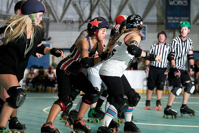
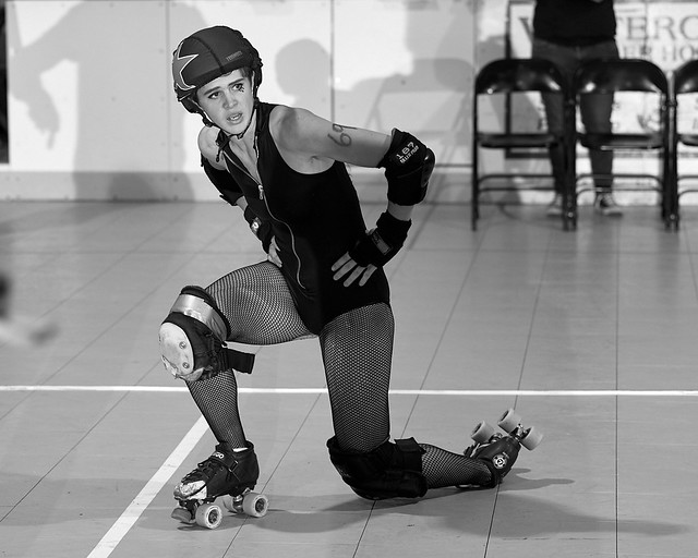
22 June 2013. Memorial Auditorium. Sacramento, CA.
Sacred City vs Viva Roller Derby.
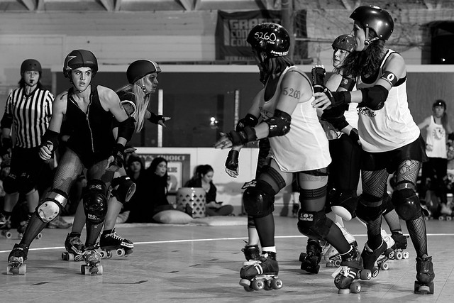
M9 Monochrome + 90 summicron.

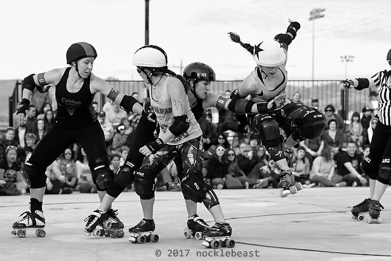
so, yeah, it's another shot from the inside track of a jammer -- maybe not the most intensist derby action ever.  The judges in the old Roller Derby Photo Contest would go on about CLEAN backgrounds. 

And derby photographers would respond (perhaps only in their own heads) how is that even possible?  There's the whiteboard center track and SEVEN referees on skates, never mind the NSOs.

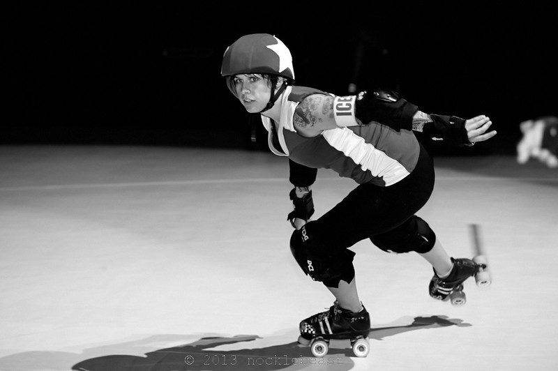
This is Skirt Vonnegut, after she skated for Silicon Valley and before she skated for Santa Cruz.  She skated for Sacred City.


  1.   intent.  It is what it is. A lead jammer in that in between moments after she's broken through the pack and before she encounters the pack again.
  2. yes, horizontal.  I believe the image is lightly cropped. I could have chosen to crop out the out of focus ref's hand indicating lead jammer, but the out of focus hand tells a story.
  3. As I said before, this is a derby bout photo with the cleanest background.  I love how the line of the outside track boundary and the boundary between the track and the black are slightly out of focus.  This may not answer the question as asked but it is the answer I have.
  4. I may have used on-camera flash for this --- but I may not have as this turn was lit a bit more than elsewhere on the rack.  Her face is lit, the track is lit--- the background is jet black.  It's the perfect light for this photo.
  5. I'm at turn 3-4 center track. I'm standing which makes me slightly above the subject.
  6. Jammer is skating from righto left with some room within the frame to skate into.
  7. This is really just a "full body" derby portrait of a jammer through turn three --- no repeated elements.  
  8. You could make the case for cropping out the out of focus referee's hand.  I didn't crop that out.
  9. black and white with a black and white camera.  Imagine the colors --- dark scarlet of Sacred City's uniforms.
  10. I believe the image is balanced with the jammer just right of center frame with room within the frame to skate into.

Sunday, October 22, 2017

She is Danymite: Compelling Frame: lesson 1 frame 2.

SHE IS DANYMITE!

She is Danymite.  18 March 2017. 16th Street Station. Oakland, CA.  Oakland Outlaws vs the San Francisco ShEvil Dead.  Taken with a Leica M-246 Monochrome and a 90mm APO Summicron.

I took this photo this spring.  It's at the 16th Street Station outdoors on a concrete patio roller derby.  

Here's the story of this photo.  I'm taking photos-- I have the pack in the frame and I notice a movement in the upper right part of the frame and I click instinctively and I click several times in the aftermath -- Danymite didn't land the jump cleanly -- after a bit  a photographer next to me asked, "Did you get that?!"  "let me check" I click through backwards in time through the frames to this photo and I yelled, "Aaaaahhh! I think I got it."

  1. My intent -- to show a moment of peak action in roller derby.
  2. Landscape mode captures roller derby action a bit easier with a rangefinder.  I did crop the photo (quite a bit).  I did keep the aspect ratio the same -- although now I think I could crop the right a little bit tighter.
  3.  The lines in the background mostly give a a context to the action in the foreground.
  4. Overall the original "out of the camera" image was over-exposed -- which create a soft high key light in the sky and some of the other whites blend in to the sky.  It was fairly...
  5. I'm sitting on the ground at turn two.  So I'm a little bit below the scene so I tend to get the horizon about waist level to the skaters when shooting derby.  Also turn two is a good place to get apex jumps by jammers.
  6. I've captured the jammer jumping past the pack and a blocker trying (mostly in vain) to stop her.   this particular moment is of peak action.
  7.  The pack is all in focus -- all in the same plane -- with the audience enough out of focus in the background to focus the attention on the action.  There's lots of audience which gives the impression of a well attended fun interesting sporting event, which adds to the photo. The lights and telephone pole in the background may be distracting but generally I am at ease with visual complexity.  That last bit -- I sometimes believe simpler images -- simpler designs are more compelling... and yet... I'm at ease with visual complexity.  I'm not sure if that's a defect or a feature.
  8. That's the thing with sport photography.  It's "shoot tight and crop tighter" and don't have so much distracting shit in the background.  In this case, the audience -- out of focus -- tells the story -- the lights -- not so much -- but sometimes you can't eliminate distracting elements in the photograph.
  9. This is a black and white photograph -- high key and high contrast (is that possible?)
  10. I think the images is balanced.  The skaters are all there -- it may take a little while for the eye to see Danymite -- the jammer jumping.
 my handwriting