
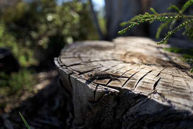
minas tirith 17 April 2016. with the Leica Q. UCSC Arboretum.
One of my photographic obsessions is with the quirky out-of-focus landscape. It was inspired by some work I saw years ago on flickr where at first glance it wasn't obvious what the distance scale was. Can a "landscape in miniature" be as epic and grand as a more traditional landscape? Or is it merely a sly joke pretending to be grand? Can it be a little bit of both?
I named the photograph "minas tirith" after the fictional city of the Lord of the Rings. In Peter Jackson's movie, Lord Denethor (the mayor of Minas Tirith and Steward of Gondor) jumps off a cliff to his death. Is this little lizard also precariously on the edge of a cliff? Or is he just sunning himself on a eucalyptus stump as a photographer sticks a camera in his face?
Let's get to the questions.
- My intent. Oh, look! a cute lizard thing on the edge of a precipice/stump (see above).
- Horizontal because it's a landscape. 3x2 aspect ratio is the same. I tried to frame it in such a way to have lots of gloriously out of focus background.
- the most well defined lines are on the edge of the stump and the radial lines cross/cutting underneath the lizard. The most dominant shape is the semicircular stump, half in focus, half out of focus. The radial lines may guide the eye toward/away from the gecko. And the lines of the in-focus branches also point toward the gecko.
- There's the bright light of/on the stump and the more subdued out of focus background light. I was definitely attracted to the light--- this image is just a few feet and on the same day away as the prickly rasp ferns.
- I had to hold the camera lower and out and frame using the little TV screen on the back of the camera. To be nearly level with the gecko is a better perspective than being above the gecko. Having the gecko nearly center frame is best as the little guy is such a small element in the entire frame, I think.
- the moment is of a gecko sunning himself on a stump, while being slightly perturbed that there's a camera in his face-- he's looking towards the camera. I think the composition is slightly stronger with the creature looking toward me.
- It's certainly a contrasty image which I pumped up the contrast. The in and out of focus radial lines of the stump are an interesting pattern.
- It's possible that some of the gratuitous out of focus background subtracts from the image. Does there have to be so much of that? But I really like that, I think the image would be weaker if there wasn't the in focus branches pointing back towards the gecko.
- The colors are relatively subdued--- just green and brown. I don't think the green distracts from the main focus of the photo.
- I think the image is balanced. The edges of the stump-- lower left, right, upper left have a rule of thirds (or fifths) thing going for it.


No comments:
Post a Comment