Because I'm a country bumpkin from little ol' Santa Cruz, I sometimes find freeways hard and knowing the difference between Richmond and Oakland is sometimes also hard (it's all just one big city, aaaah!). Because of this, I didn't arrive as early to the bout as I like to.
If I had arrived earlier, perhaps I would have looked at the the dim (but not too dim) fluorescent lighting and taken steps to have the color of the on-camera flash match the color of the ambient light. How do you do that? Put a piece of colored plastic over the flash. Green for fluorescent. Yellow of incandescent. Maybe blue for sunlight.
What I ended up doing was using the flash with out colored plastic and setting the camera to auto white balance, which generally got the color correct where subjects were primarily lit with light from the flash. Or if I don't use flash, then the color is generally correct in the foreground and the background. However, when flash is used, subjects (in the background) where the florescent lighting dominates tended to be colored green.
So, now what. How do we deal with that situation. Some possibilities:
- Try to manually adjust the color balance in software.
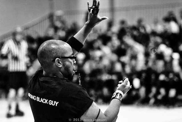
- Fuck it. Convert to black and white.
- Let the color be what it is.
Here is an example of the second option.
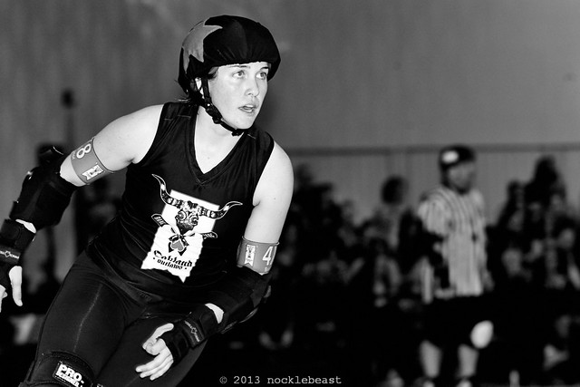
You'll notice that I've played around with the level curves, making the dark parts of the photograph darker and perhaps making the brighter bits a bit brighter. This is a style of post processing that I've adopted in the last year and a half or so. Inky blacks and bold whites. I don't know when or if I'll outgrow this style of post processing.
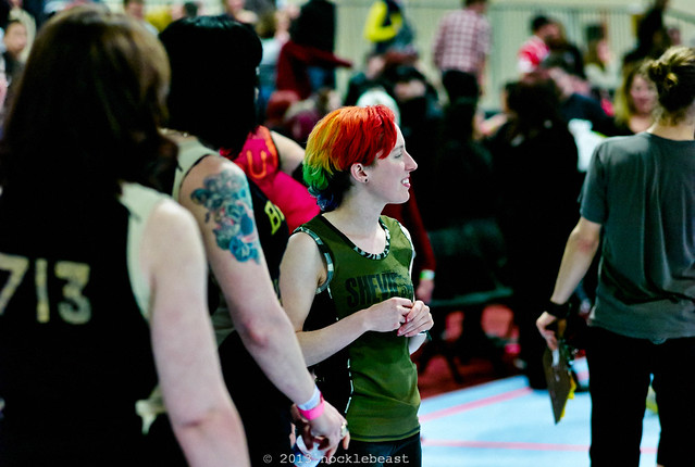
This is a photo of Steely Jan on the jam line. I didn't use flash, so the camera's auto white balance should (more or less) adjust the color for the fluorescent lighting.
I've stomped down on the lower part of the level curve, making the blacks inky dark and black, and in the process the colors in the medium to dark values are also a bit more saturated.
Look at the background. It's relatively well lit. This is different than many derby venues where the audience is not well lit. And the walls are actually slightly green. The walls inside the smaller of the two main rooms at the Oakland Convention Center are green or greenish brown.
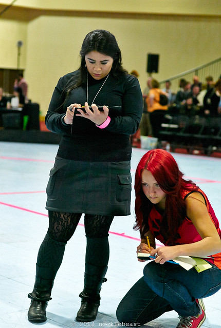
Here's another shot without flash during half time. Do you see the color of the wall in the background?
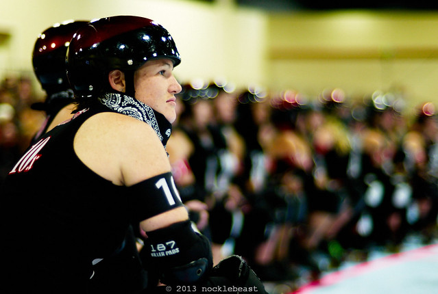
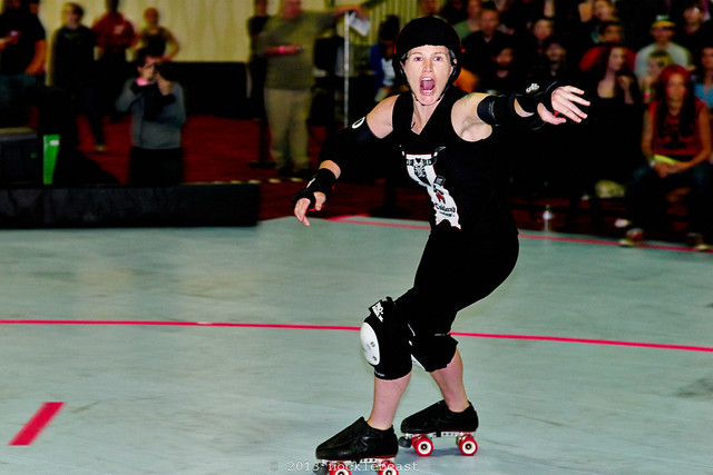
Here's another one without flash. One of Oakland's rock star jammers, Huck Sinn, just before player introductions. I've stomped on the level curve again. Oakland's black uniforms are inky jet black. And the background is well lit, and green.
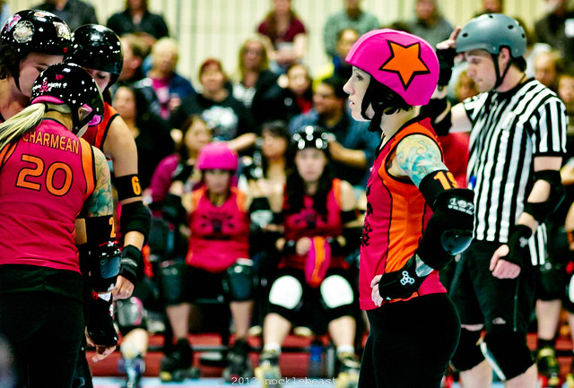
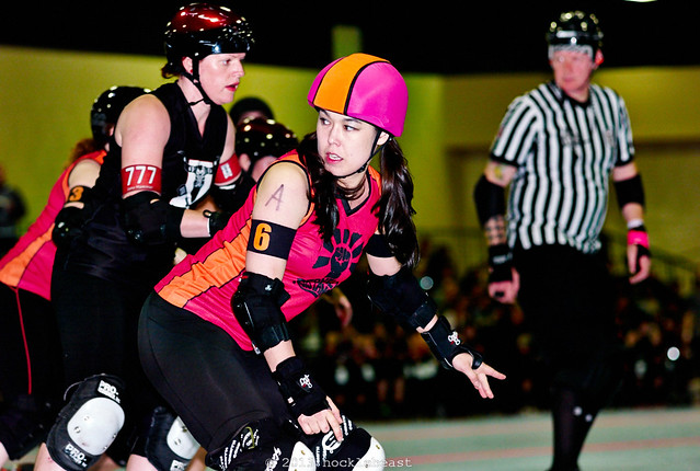
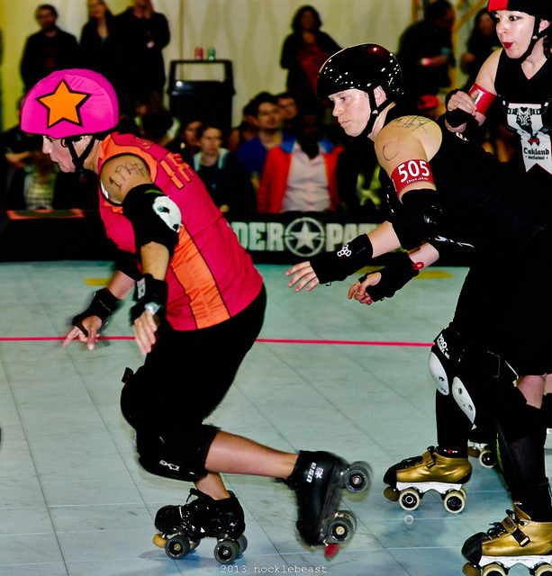
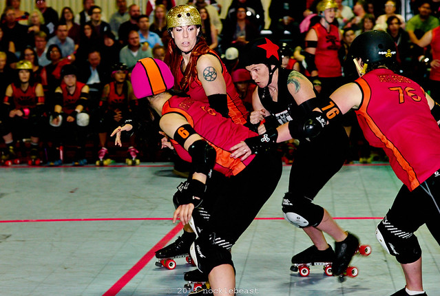
So what happens when you combine the naturally well lit green background with the green fluorescent lighting in the background and the foreground lit by flash? Really really really green backgrounds!
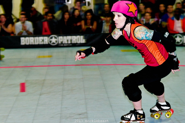
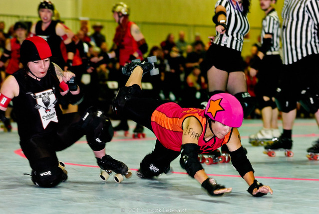
Berkeley's fuchsia and orange uniforms pop against the green background.
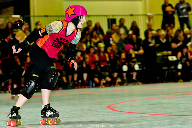
And Oakland's inky black and saturated red uniforms pop against the green too.
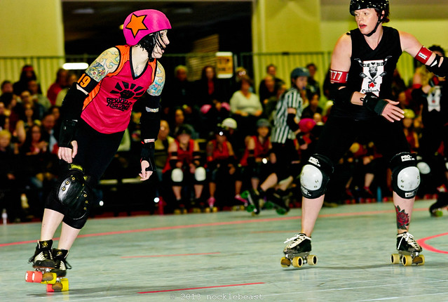
The color isn't exactly "true to life." The color is what it is.
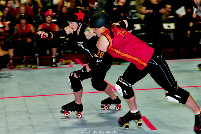
Some more photo highlights!
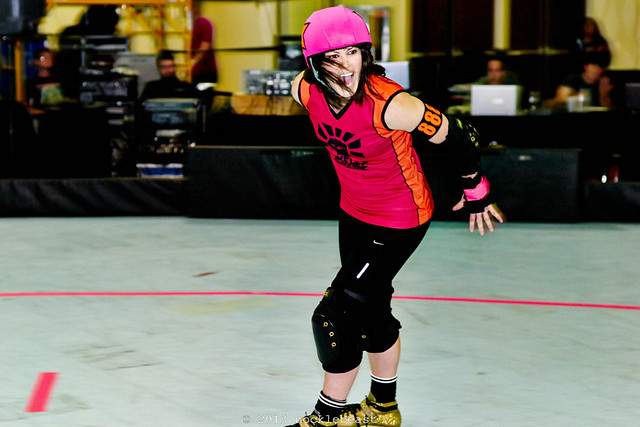
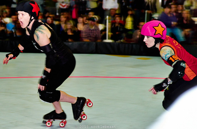
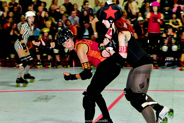
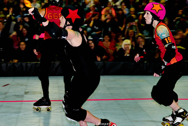
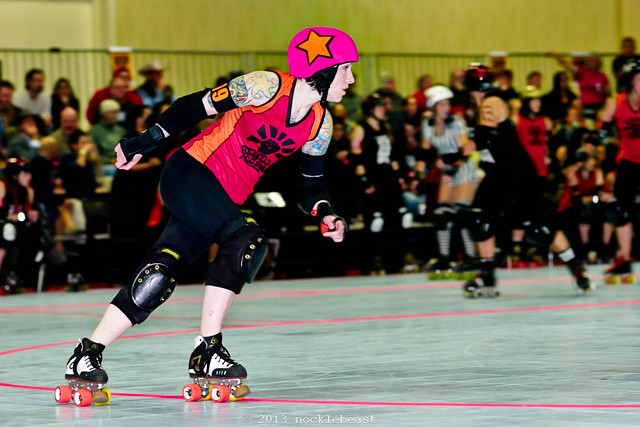
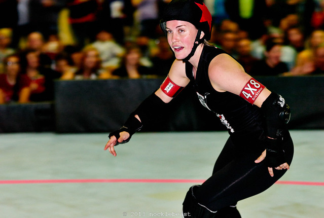
the full flickr set is here: http://www.flickr.com/photos/nocklebeast/sets/72157633361574661/


No comments:
Post a Comment